Progress Indicator
Best practice
- Use progress indicators when progress on a task can be quantified. (e.g 2.0 out of 5.2 MB uploaded)
- Provide informative labels that indicate the progress status (e.g., “Update 45% complete”)
- Avoid misleading progress indicators that do not accurately reflect the task’s progress.
- Avoid blocking the entire UI with a progress indicator unless the context requires it.
- When applicable, include control buttons with a progress indicator for actions such as pause and cancel.
- Consider using the toast component to let users know when progress is completed or has failed.
Usage
Progress indicators can be embedded in various UI elements like data tables, dashboards, and drawers. However, there are instances where you should avoid using them or opt for the loading indicator.
| Scenario | Loading indicator | Progress indicator |
|---|---|---|
| Unknown task duration | Ideal choice | Not suitable |
| Known, measurable progress | Not suitable | Ideal choice |
| Brief interactions (<1 second) | Unnecessary visual noise | Unnecessary visual noise |
When to use
- When task duration and progress can be measured and communicated accurately to manage user’s expectations.
- When a user initiates processes like uploading shipping documents, generating new schedules, or updating systems with large data sets.
- In dashboards or detailed tracking views to visualise the completion state of tasks or shipments.
When not to use
- When task duration or progress cannot be measured reliably, use the loading indicator instead.
- When loading duration is brief (< 1 sec. ) or instantaneous, avoid progress indicators.
Variants
There are two variants of the progress indicator that can be used depending on available space, user expectations, and context. These indicators visually communicate measurable progress from 0% to 100%, helping manage user expectations.
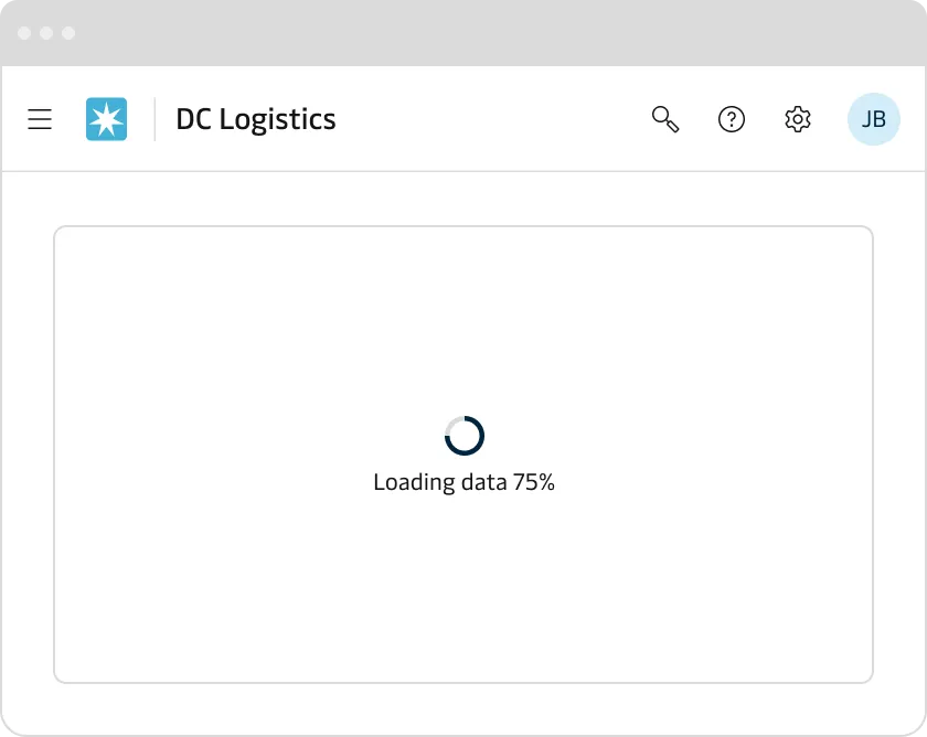
Ring progress indicator
The ring progress indicator is a suitable choice for clearly indicating measurable progress in compact or isolated UI elements, such as shipment status cards, dashboard widgets, or detailed tracking views. It helps users quickly assess the current status or percentage completion of logistics tasks and shipments.
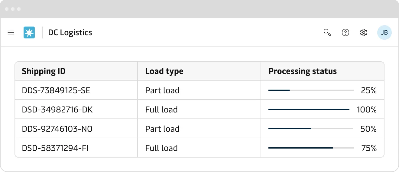
Bar progress indicator
The bar progress indicator is ideal for horizontal spaces, especially in long forms, data tables, dashboards, or header sections. It provides clear visual feedback for tasks such as uploading documents, generating shipment labels, or processing bulk updates, ensuring users have a clear understanding of the current progress state.
Appearance
Use appearances to convey intent, not decoration. Default to Primary appearance for ongoing, neutral progress. Only use Success/Warning/Error when the system has a clear outcome or the user must notice a condition. The Neutral inverse is intended for better contrast on dark or complex backgrounds.
- Do not encode meaning by colour alone. Pair the appearance with a status text (e.g. “Progress is on hold”).
- Use Primary appearance during the operation and optionally switch to Success/Warning/Error only when the state is known (complete/partial/failure).
Primary
The primary appearance is the default option and should be used for most determinate progress. For example: Uploads, exports and background data sync. Avoid using it on dark surfaces, use Neutral inverse instead.

Neutral inverse
Neutral inverse appearance allows you to optimised the contrast when the primary appearance is not enough. For example, when the component is placed on dark background, images and video backdrops.

Success, warning and error
Avoid using Success/Warning/Error appearance for routine, non-critical background tasks. Use only when there is a clear outcome and benefit for the user.
- Use Success appearance to show positive outcome after the progress is completed. e.g. “Shipment confirmed”.
- Use Warning appearance to visualise non-blocking issues or conditions that require the user’s attention. e.g. “Slow connection - may take longer” .
- Use Error appearance for blocked or aborted process. e.g “Failed to upload”.

Accessibility
- Use adequate colour contrasts between progress indicators and their backgrounds.
- Make sure ARIA labels are present and represent correctly the label and progress values.
- In case the progress indicator includes custom interactive elements (e.g., pause, cancel) ensure that they support keyboard navigation.
- Consider visually hidden status updates via live regions for screen reader users, especially for critical real-time task updates.