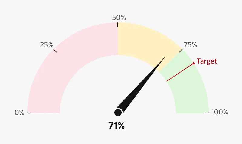
Meter chart
Meters are particularly helpful when the expected value of the data is already known and the user wants to know the current performance of a particular metric. The most typical variant of Meter charts is the speedometer/gauge chart that use a needle to show information on a dial. The meter range can be color coded to show performance levels (e.g. showing green for “excellent” and red for “below expectations”).
A drawback of meter charts is that they take up a lot of space and typically only show a single point of data. If there are many meter charts representing a single performance scale, other charts types might be more effective, e.g. Bar charts and Bullet charts.
Best practice
Use this chart type when there is a minimum and maximum value
A speedometer/gauge chart needs to have an explicit range (minimum and maximum values) so that a metric can be accurately and consistently plotted.
Show contextual information
Provide additional information about the target metric, rate of change and other important aspects of the measured performance.
Use colours for thresholds
Use colours to show different thresholds or zones and clearly show where the measured value is on that scale.
Use only a few colours
Limit the amount of colours to 2 - 3 for each chart and avoid high contrast color combinations between the sections. See the Chart style guide and Colour best practice pages for additional guidance on appropriate colour choices within the Maersk colour palette.
Clearly show the target
Visualise a target as a distinct line on the scale so that it is easy to spot at a glance.