Chart style guide
Basic elements of a data visualisation and advice on when and how to display them.
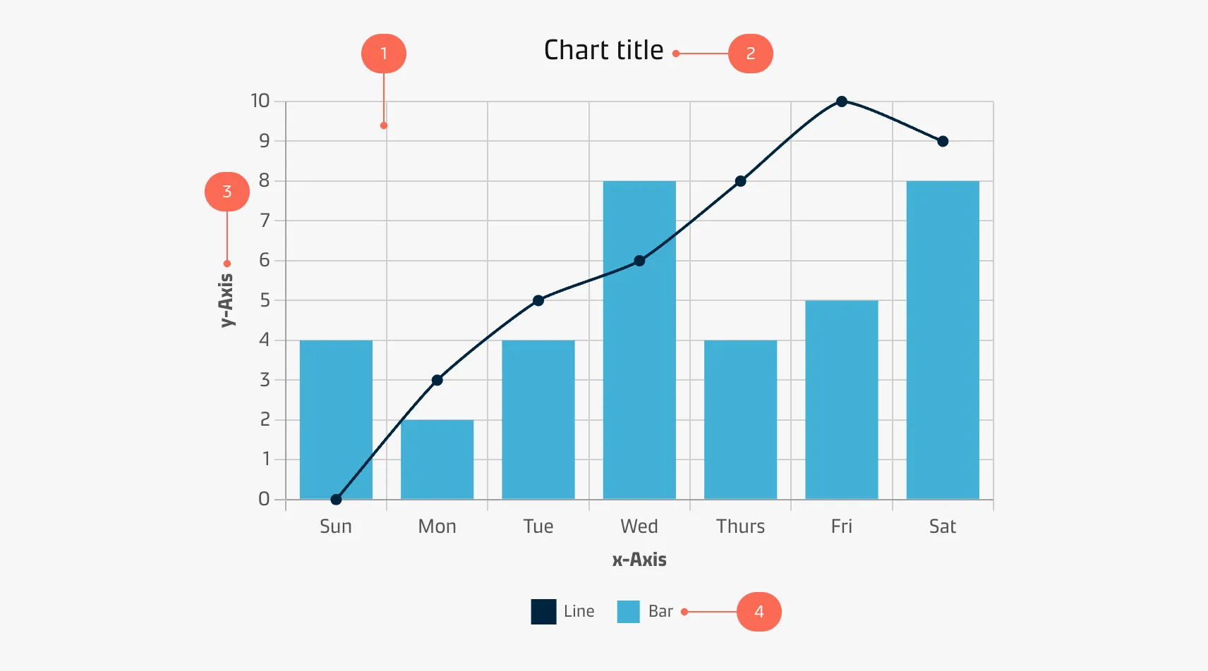
Graph
The graph is the main character of your storytelling and should be the centre of attention. Furthermore, it must be as easy as possible to decode the information from the visualisation.
| Styling: Graphs | |
|---|---|
| Line width: | 2px |
| Stroke style: | Solid |
| Points/dots/joints: | 4px solid circle |
| Styling: Categorical colours | |||
|---|---|---|---|
| Data 1: Blue-300-Maersk | #42B0D5 | rgba(66,176,213,1) | |
| Data 2: Blue-900-Dark | #00243D | rgba(0,36,61,1) | |
| Data 3: Grey-400 | #CFCFCF | rgba(207,207,207,1) | |
| Data 4: Red-300-Accent | #FA6A55 | rgba(250,106,85,1) | |
| Data 5: Teal-300-Accent | #4DB5AB | rgba(77,181,171,1) | |
| Data 6: Grey-300 | #EDEDED | rgba(237,237,237,1) | |
| Styling: Sequential colours | |||
|---|---|---|---|
| Data 1: Blue-900-Dark | #00243D | rgba(0,36,61,1) | |
| Data 2: Blue-800 | #003D6D | rgba(0,61,109,1) | |
| Data 3: Blue-700 | #005487 | rgba(0,84,135,1) | |
| Data 4: Blue-600-Dark | #0073AB | rgba(0,115,171,1) | |
| Data 5: Blue-500 | #058EC6 | rgba(5,142,198,1) | |
| Data 6: Blue-400 | #0CA0CE | rgba(12,160,206,1) | |
| Data 7: Blue-300-Maersk | #42B0D5 | rgba(66,176,213,1) | |
| Data 8: Blue-200 | #77C6E0 | rgba(119,198,224,1) | |
| Data 9: Blue-100 | #91D8F2 | rgba(145,216,242,1) | |
| Data 10: Blue-50 | #B5E0F5 | rgba(181,224,245,1) | |
| Styling: Gradual colours | |||
|---|---|---|---|
| Max: Blue-900-Dark | #00243D | rgba(0,36,61,1) | |
| Mid: Blue-400 | #0CA0CE | rgba(12,160,206,1) | |
| Min: Blue-50 | #B5E0F5 | rgba(181,224,245,1) | |
| Styling: Sentiment colours | |||
|---|---|---|---|
| Positive: Success | #40AB35 | rgba(64,171,53,1) | |
| Neutral: Warning | #FFD029 | rgba(255,208,41,1) | |
| Negative: Danger | #B80012 | rgba(184,0,18,1) | |
Title & subtitle
Title
A good title is short, clear, and tells a story on its own. Implementing a title frames the story, purpose and meaning of a chart.
| Styling: Title | |
|---|---|
| Font face: | Maersk Headline (alternatively Helvetica, Arial) |
| Font size: | 20px |
| Font weight: | Regular |
| Font colour: | Grey-900-Black #141414 | rgba(20,20,20,1) |
Subtitle
You may add a descriptive subtitle to include additional context to your chart, such as the origins of the data.
| Styling: Title | |
|---|---|
| Font face: | Maersk Text (alternatively Helvetica, Arial) |
| Font size: | 26px |
| Font weight: | Regular |
| Font colour: | Grey-600 #878787 | rgba(135,135,135,1) |
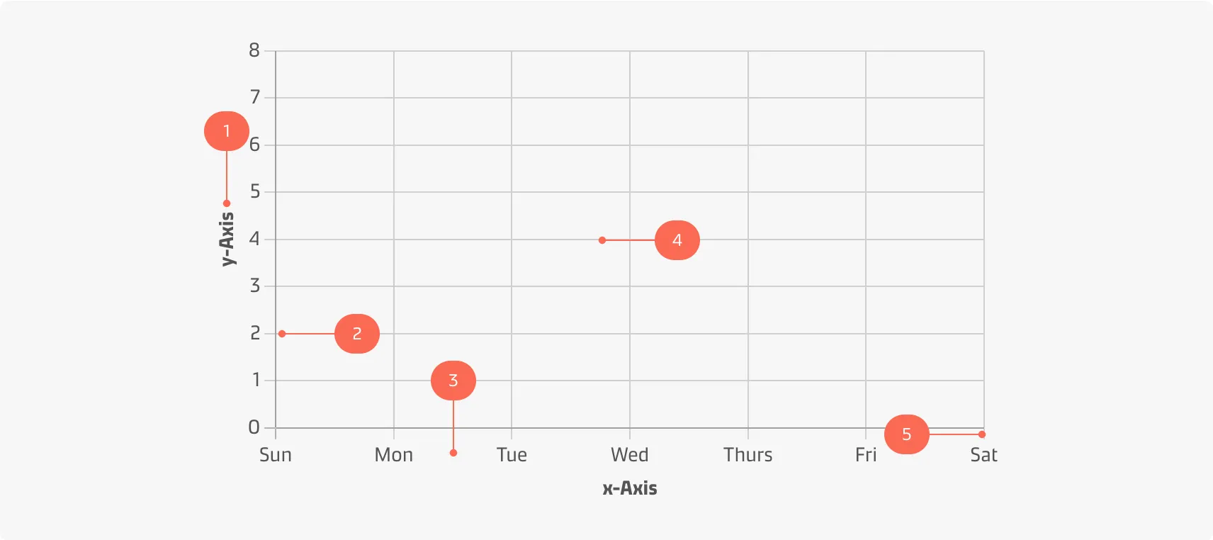
Axes & grid
Many charts use a classical cartesian coordinate system with a y-axis and an x-axis. The elements of the axes and the grid are shown below:
| Styling: Axis title | |
|---|---|
| Alignment: | Centered relative to axis |
| Font face: | Maersk Text (alternatively Helvetica, Arial) |
| Font size: | 14px |
| Font weight: | Bold |
| Font colour: | Grey-900-Black #141414 | rgba(20,20,20,1) |
| Styling: Axis label | |
|---|---|
| Alignment: | Centered relative to tick mark |
| Font face: | Maersk Text (alternatively Helvetica, Arial) |
| Font size: | 14px |
| Font weight: | Regular |
| Font colour: | Grey-900-Black #141414 | rgba(20,20,20,1) |
| Styling: Axis | |
|---|---|
| Stroke width: | 1px |
| Stroke style: | Solid |
| Colour: | Grey-500 #B2B2B2 | rgba(178,178,178,1) |
| Styling: Grid lines | |
|---|---|
| Stroke width: | 1px |
| Stroke style: | Solid |
| Colour: | Grey-400 #CFCFCF | rgba(207,207,207,1) |
| Styling: Tick marks | |
|---|---|
| Stroke width: | 1px |
| Length: | 8px |
| Stroke style: | Solid |
| Colour: | Grey-400 #CFCFCF | rgba(207,207,207,1) |
Legend
A legend tells the user what the colours and shapes of the chart represent.
| Styling: Legend title | |
|---|---|
| Font face: | Maersk Text (alternatively Helvetica, Arial) |
| Font size: | 16px |
| Font weight: | Bold |
| Font colour: | Grey-700 #545454 | rgba(84,84,84,1) |
| Styling: Legend label | |
|---|---|
| Font face: | Maersk Text (alternatively Helvetica, Arial) |
| Font size: | 16px |
| Font weight: | Regular |
| Font colour: | Grey-700 #545454 | rgba(84,84,84,1) |
Contributors
Thomas Bove
UX Designer