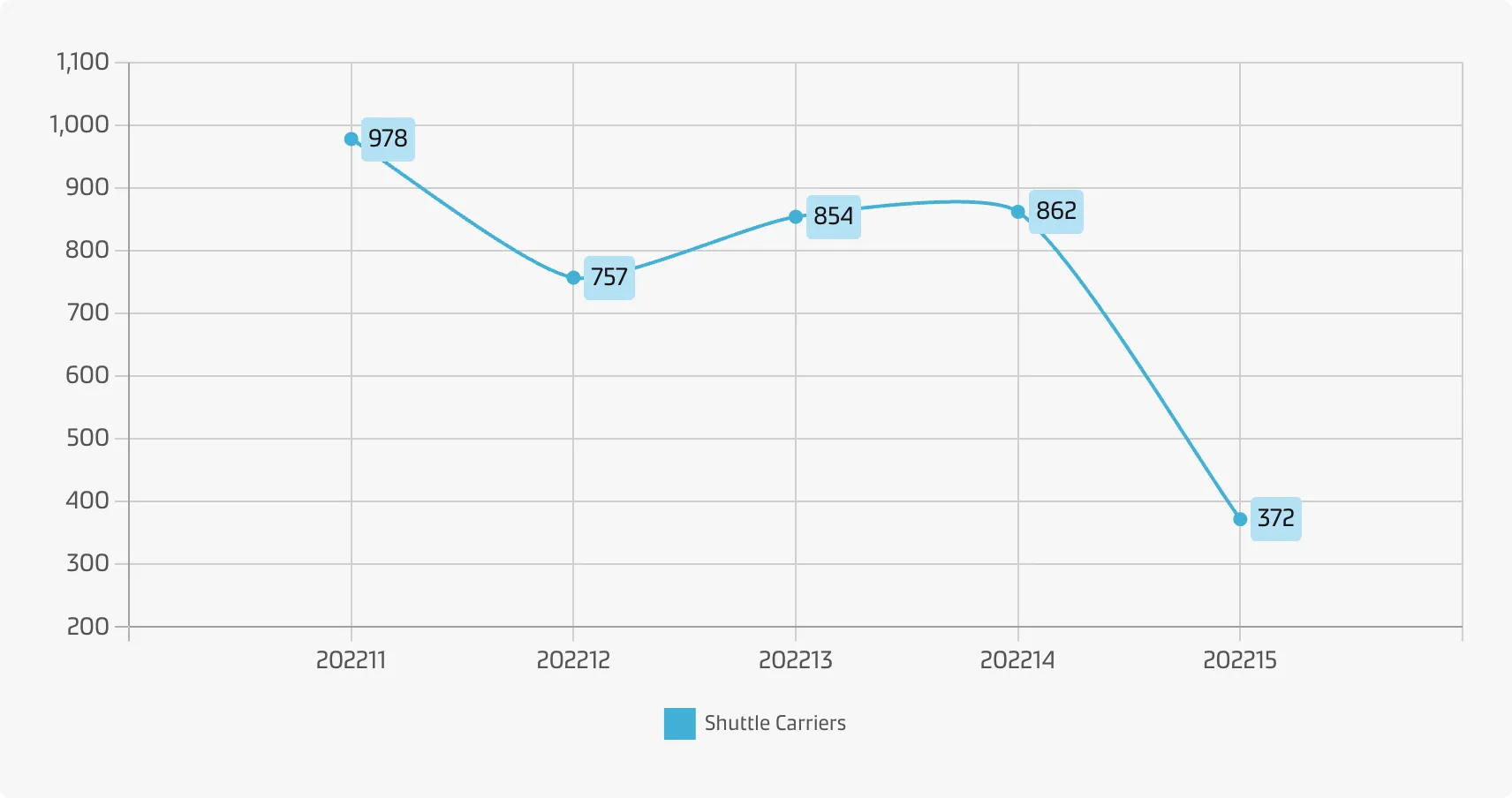
Line chart
The horizontal axis depicts a continuous progression, often that of time, while the vertical axis reports values for a metric of interest across that progression. The line graph can show a single series of data, two series of data, or multiple series.
Line charts are useful to show trends or progress over time (both historical and forecasted data). They have the advantage that you can compare and present lots of data at once.
Example
Best practice
Don’t plot too many lines
A good rule of thumb is to limit yourself to five or fewer lines, lest the chart ends up looking like an unreadable tangle. However, if the lines are well-separated, you can still plot all of the values you wish to track.
The axis may not start from zero
A zero baseline is not required, but it is recommended.
Choose an appropriate measurement interval
For temporal data, a measurement interval which is too broad may mean that it takes too long to see where the data trend is leading, thus hiding a meaningful signal. On the flip side, a measurement interval which is too short may only reveal noise rather than signal.
Use solid lines only
Dotted or dashed lines are distracting (but may be used for forecasts).
Label lines directly instead of using legends
Often it is possible to label the lines directly which makes the graph easier to interpret (a label may not be needed if there is only one line).