Clustered bar chart
Use a clustered bar chart when you want to show how a second variable changes within a category and allow the user to compare across categories. If it is important for the user to compare totals a Stacked bar chart may be more appropriate.
A clustered bar chart can be displayed with vertical bars (primary categories on the horizontal axis) or horizontal bars (primary categories on the vertical axis):
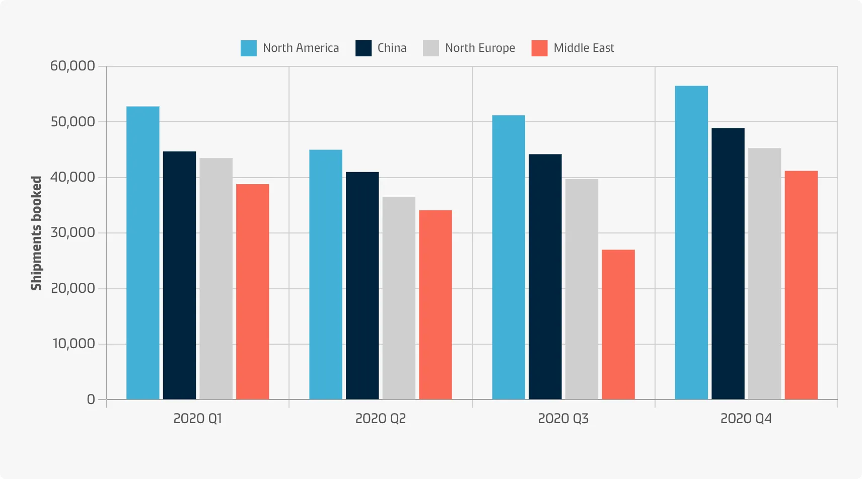
Vertical
Vertical bar charts are useful when you’re graphing ordinal variables (i.e. when subcategories have a natural sequence). They are useful for comparing different categorical or discrete variables if there are few categories and if their names are short.
Example
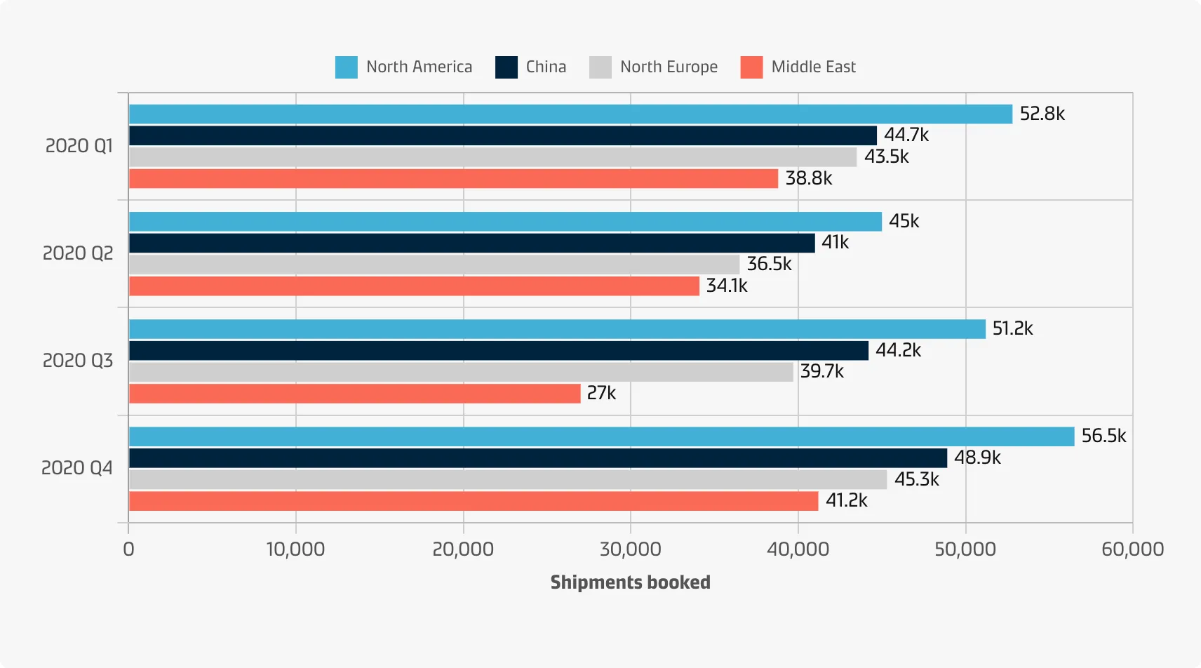
Horizontal
Horizontal bar charts are especially useful if you have many categories or if the category names are long because there is plenty of space for the labels when they are displayed below (rather than beside) each other.
Example
Best practice
Decide on the primary and secondary variables
You need to decide which of the two variables will be the primary (dictating the axis locations for each bar cluster) and which will be the secondary (dictating the number of bars to plot in each cluster). The most important one is usually the primary.
Decide on the order of category levels
For the primary variable, the principle of ordering bars from largest to smallest applies unless they have an inherent order. For the secondary variable, it is usually recommended to have a consistent order of bars across groups rather than ordering the bars from largest to smallest within each group.
Choose colours effectively
Colours are an integral part of the grouped bar chart in order to distinguish levels of the secondary categorical variable. See the Chart style guide and Colour best practice pages for additional guidance on appropriate colour choices within the Maersk colour palette.
Maintain a zero line
Show the zero-baseline to avoid distorting the data.
Value annotation
Annotations for bar lengths can be added to a clustered bar chart just as they can for the standard bar chart. Horizontal bars leave more space for large values.