Chart best practice
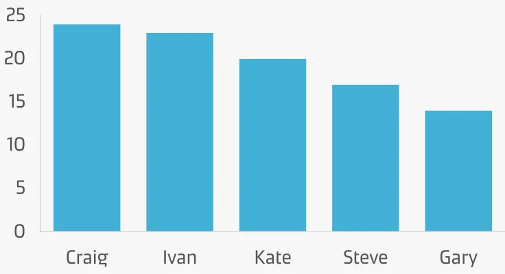
Reduce clutter
Only include what is necessary. Remove chart junk, e.g. backgrounds, redundant labels, unnecessary colours, effects, bold and heavy lines, etc.
Format for simplicity
Format your charts to make them easier to understand and more aesthetically pleasing.
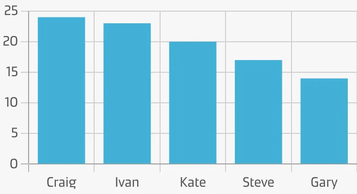
Grid lines
Grid lines help the user compare key thresholds. Without them, the mind has to draw an imaginary line to make comparisons.
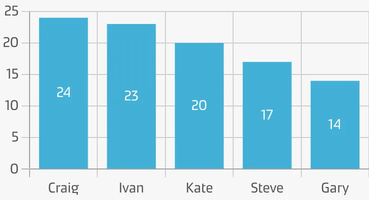
Labels
Labels supplement the visual representation by displaying exact values and are valuable for static charts that don’t have tooltips on hover.
Axes
Format axes to clearly show the scale and intervals of your charts. Make sure the axis labels and spacing are easy to read.
Add clarity
Make your chart easy to understand by clearly showing people what it represents.
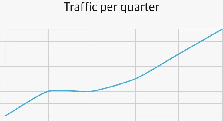
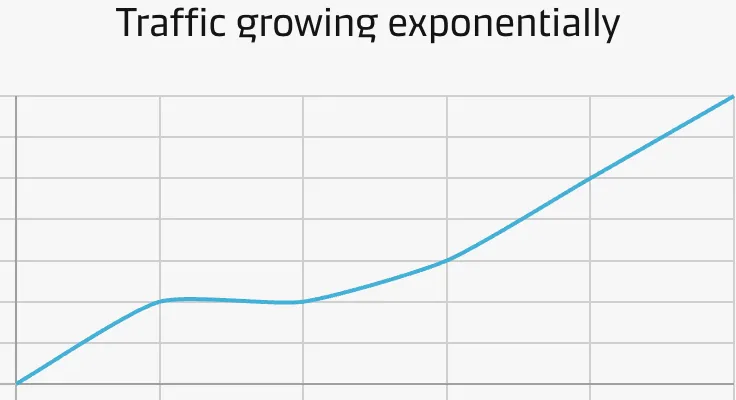
Chart titles & descriptions
Use a title to frame a chart’s story, purpose, and meaning.
Use a subtitle/description to add additional context to your chart, e.g. how and when the data was collected.
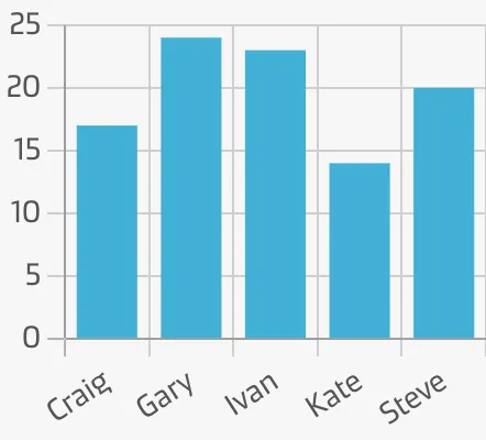
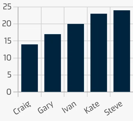
Sorting
Sorting can help people make sense of your charts, by telling the story in a meaningful order.
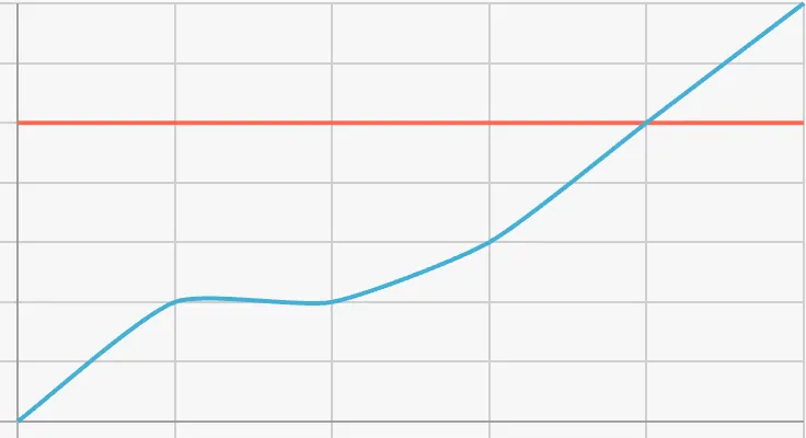
Annotations & comments
Add context and perspective to your chart by annotating data or adding comments.
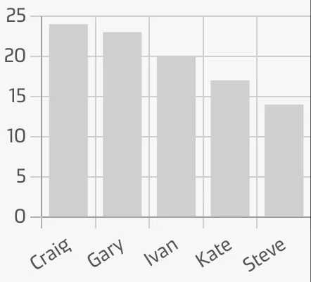
Highlight what’s important
Too much information can be overwhelming and hard to make sense of. Make critical insights and data points stand out by visually directing your audience’s attention to the most important part(s).
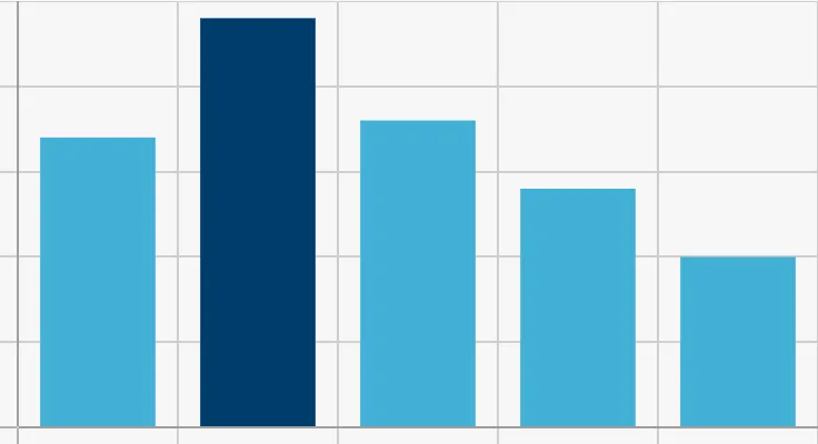
Directing attention to these methods can increase the ‘dwell time’ of your reports, leading to a better understanding of the story your data tells.