Colour best practice
If not applied deliberately, colour can make the data confusing, difficult to read, and break with brand standards.
When applying colour, consider the following:
- The use of colour has a purpose.
- The colours are consistent with Maersk’s brand identity.
- Your data visualisation is not solely relying on colour to convey meaning.
This section provides some useful dos and don’ts for colour use in charts.
Find more details about Maersk’s official colours and colour hierarchy in Brand Central.
Categorical colours
Categorical colours are not ordered. Use these for categorical scales and not for ordinal, interval, or ratio scales.
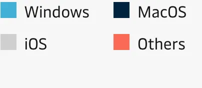
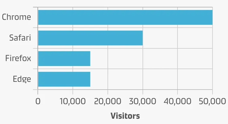
Use categorical colours only when it’s necessary
An exception is when a chart is placed in connection with other charts that use colour for the same categories.
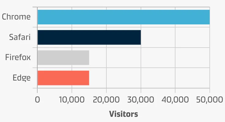
Use up to six categorical colours
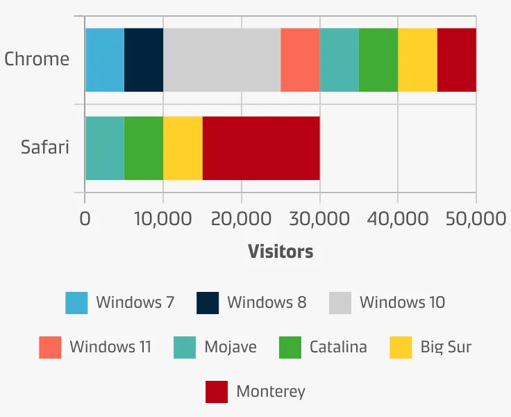
Categorical colours become harder to distinguish from one another when six or more colours are used.
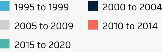
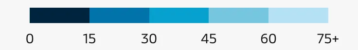
Sequential colours
Sequential colours are ordered. Use these for ordinal and interval scales. It’s also acceptable to use these for ratio scales. Do not use these for categorical scales.


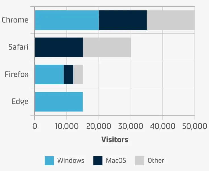
Use darker colours to show larger numbers
Dark colours can carry a subconscious association with density. Use a sequential colour scale that transitions from lighter to darker as the numbers get larger.

Diverging colours
Diverging colours are also ordered. Use these for ordinal and ratio scales, especially when there is a meaningful middle value. These may also be used for interval scales. Do not use these for categorical scales.


Additional dos & don’ts
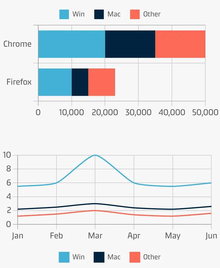
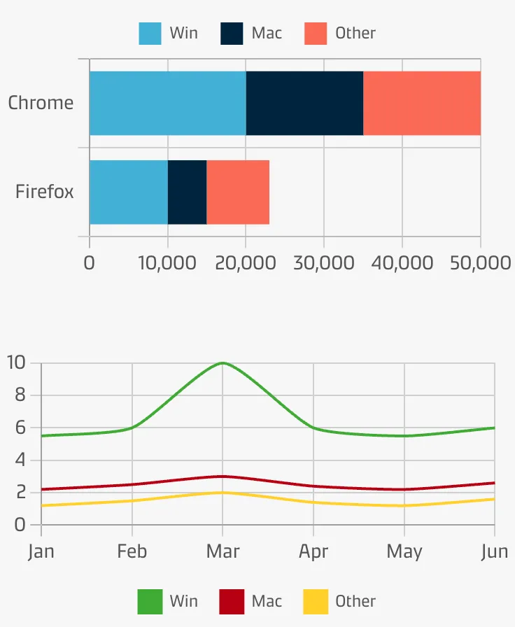
Be consistent with colour across charts
If a colour is used to represent something in one chart, all other charts should echo that relationship.