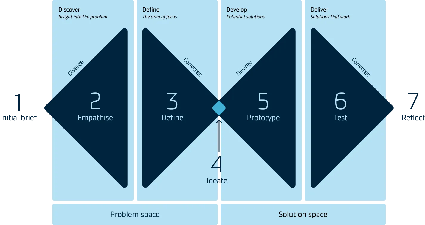
Data visualisation process
To get you on the way and to ensure that you create well thought through data visualisations, we have created the following data visualisation process based on a common Design Thinking process:
Starting point and iterations
The data and information you have about your target audience will help determine where in this process to begin.
For example, if you have a well-defined target audience, then you exactly know in which context/situation your data is valuable. In this situation, you might start with the ideation of different solutions (step 4) and then build a concrete prototype (step 5).
It is important to note that data visualisation is an iterative process. You often will go back to previous steps based on new insights. For example, going from testing (step 6) to a new prototype (step 5), or you might even go back and gather more information about your target audience (step 2).
Step 1: Initial brief
At the start, the initiative owner should share an initial brief with the rest of the team. This way, everyone involved understands the background of the initiative and the overall goal. The brief should capture the following details:

- Description of the initiative
- Goal of the initiative
- Users and Stakeholders
- Value for the business and for the end users
- Available data (If any)
- Expected timeline
A good brief provides everyone with a clear scope and direction for the next steps.
Step 2: Empathise
In the second step, the focus is on gathering insights about your target audience and the context in which they operate.
Familiarising yourself with the data that is available is also a part of this step.
Understand your audience and context
- Who is your target audience? (be specific)
- What type of information do they need, where will it be used?
- What will your audience do with the insights derived from the data visualisation?
Familiarise yourself with datasets and metrics
The data is the supporting evidence for the story you will be telling.
Your starting point may be a dataset or some standard metrics. Datasets are the set of numbers or calculations gathered. Metrics set the parameters of the dataset that your organisation will use to measure performance.

If your starting point is a dataset, dive into it to narrow down the focus of your charts and develop metrics that represent what you want to show. If your starting point is metrics, acquire a basic understanding of what business purpose they serve. Doing this will help to design a cohesive story for your audience.
The metrics you choose for your visualisation should be few and thoughtfully conceived because they will powerfully influence what your audience will learn from the story. The best metrics have a clear link to actions and are easily understood by your audience.
Step 3: Define
In step 3, you articulate your problem or opportunity based on the insights from steps 1 and 2 and define a clear objective to work towards.
There are two sub-phases in this step.
1. Redefine the initial brief (refer to Step 1)
The initial brief should be updated based on the user need, key insights discovered and availability of desired datasets for metrics.
2. Build your story
Start developing a basic story around the data and the insights collected.
The data story structure should help you to define:
What do you want to tell the audience and when?
What can your audience do with these insights?
One way of building a compelling story is to use the traditional three-act story structure, where the story consists of three core elements - the context, the core insight and the action.
Step 4: Ideate
When you have defined the problems, the opportunities and the data story, you can move on to the ideation phase to explore solutions. During this phase, prioritise quantity over quality to get a diverse range of ideas to prototype and test.
The ideation stage flows between idea generation and evaluation, but each process must remain separate from the other.
Key steps for ideation on data visualisation are:
- Stay focused on one topic
- Sketch possible charts to support your data story (consider alternative chart types)
- Dive into your dataset by sketching rough drafts on paper
- Go for quantity
- Share drafts with colleagues early and often
- Gather as much feedback as you can
- Select the best chart solution
Step 5: Prototype

Take the best chart solution from the previous step and create a “rough” but realistic graphical representation to test with your target audience.
When creating a prototype, you will get a good idea of what works and what doesn’t in terms of data story structure and meaning. Based on the prototype, you might need to do some tweaks to your story, so that it is easy to understand and can drive the right decisions.
It is a good idea to start with a very rough (low fidelity) representation of what you want to create and improve this over time based on the feedback you get from your audience.
Step 6: Test
In step 6, you test your prototype with people from the target audience - preferably in a real scenario context. Doing this provides an in-depth understanding of what works well and what aspects of the prototype needs further refinement before your data visualisation works as intended.
Be aware that what you suggest might turn out not to be the best solution, so be open and curious when you test. The end-user will give you direct or indirect insights if your solution solves the problem.
Step 7: Reflect & refine
Now it is time to validate the solutions and select the one that resonates most with your target audience and solves the identified problem.
As mentioned in the beginning, this is not a linear process. There could be cases where we learn something new about our end users or more about the underlying problems that can send us back to the beginning.
Next steps
Once the solution is refined to account for user feedback, the prototype then goes for implementation and is released to its customers. However, the design thinking process doesn’t end here. The released solution may need ongoing enhancements such as usability improvements. You may, for example, monitor the usage of the dashboard to find out how often it is being used and shared. It gives insight into how much impact you have had with it.