To support different use cases and applications, the Maersk Design System core components typically come in 3 different fit (sizes) - small, medium and large.


How to use
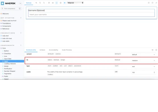
In code, the property “fit” is used to change the size of the components and in Figma there is also a “fit” option.

When to use
The following is a high-level direction on how to use the small, medium and large components:
Small components allow for more dense layouts which is often needed in very data and information heavy applications. Small fit is also a good choice, if the end-users are working on smaller desktop screens and you need to provide them with a very compact layout or view.
Medium is the default component size that is used on Maersk.com and it is often the right choice, if you are building customer facing websites that are not too data heavy.
Large components support more relaxed and spacious layouts that works well on more visual and brand related pages e.g. marketing landing pages. Also use large fit for touch devices where a bigger touch area is needed.
Keep it consistent
In most applications, it is a good idea to stick to one component fit (size). Mixing components with different fit can make the application hard to keep consistent and in the end hard to maintain.
If you are mixing components with different fit, then make sure that it has a very clear purpose and there are clear rules on when to use which.
Why is it called ‘fit’?
When naming the properties for our core components, we always look to provide consistent naming for both design and engineering.
At first, we chose the property name “size”, but this clashed with the existing “size” property on the HTML input field. In this instance, “size” indicates how many characters wide the input field should be.
We also considered “scale” and “density”. Both do not accurately reflect our solution. We do not simply scale a component to make different sizes. Similarly, we do more than adjust the internal spacing within a component (density).
The conclusion was to borrow an analogy from clothing. A shirt, for example, can be available in a “tailored fit” or “loose fit”. In both, the size of each fit is different. However, certain parts are the same, for example, the size of the buttons used.